
I applied for the Kawaguchi City Museum of Art’s logo and symbol mark contest that will be open in January 2025. Unfortunately, I was not selected, but it was a very meaningful experience for me to be able to give form to my own ideas and expressions, and to work on the highly public theme of an art museum.
In this issue, we would like to introduce the three entries that we created based on different concepts and approaches to expression, as well as our thoughts on the designs we put into them.
Concept and mission sought
The following is an excerpt from the Kawaguchi City Museum of Art Logo and Symbol Mark Application Guidelines.
CONCEPT
A completely new center for the creation and dissemination of culture and the arts, where citizens gather, interact, and nurture creativity, culture, history, and industry.
- Citizens gather and interact
- Fostering creativity, culture, history and industry
- A completely new base for the creation and dissemination of culture and the arts
MISSION
To achieve the concept, we have three major missions to achieve our goals.
- Succession
- Symbiosis
- Cultivation
IDEA 1. “A bridge to the future of art”
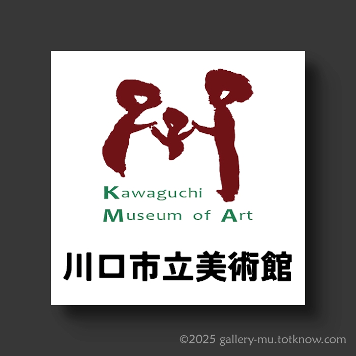
The design concept
The color scheme is brown for Kawaguchi’s traditional cupola and green for Angyo’s plantings. The character for “river” is designed to resemble three people, promoting “inheritance, coexistence, and nurturing”.
The color scheme is brown to represent the cupola, which is a symbolic traditional industry of Kawaguchi City, and green to symbolize the abundant “planting” of Yasugyo. In addition, the character for “river” in the symbol mark is used as three figures to visually express the three missions: “inherit,” “coexist,” and “nurture. This design symbolizes the museum’s philosophy of coexistence between people and the creation of new value, while passing on local culture and nature to the next generation. Through a simple yet warm composition, we tried to create a design that conveys the charm of the region and gives a friendly impression.
IDEA 2. “Open, grow, art leaves”
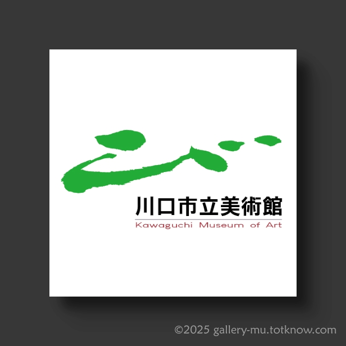
The design concept
Designed based on “Bi(beauty)” written in traditional calligraphy. The design is expressed in the green of Angyo. The upward movement of the right shoulder appeals to the future (inheritance).
The “bi” character written in traditional calligraphy was used as the motif, and the brush strokes were used to create a symbolic arrangement. The “bi” is painted in green, representing the planting of trees in Angyo, to emphasize the nature and culture of the region. In addition, the entire design is composed in a right ascending direction to strongly emphasize the will to [inherit and nurture] leading into the future. In addition, the four dots with different shapes express the “symbiosis” of diversity. The brown color of the English logo, representing the cupola, was used to express the weight of tradition and the creation of new values, while at the same time creating a symbol mark that is both familiar and hopeful. This design will symbolize the museum’s efforts to nurture the future together with the community.
IDEA 3. “Trajectory of Creation, Flying into the Future”
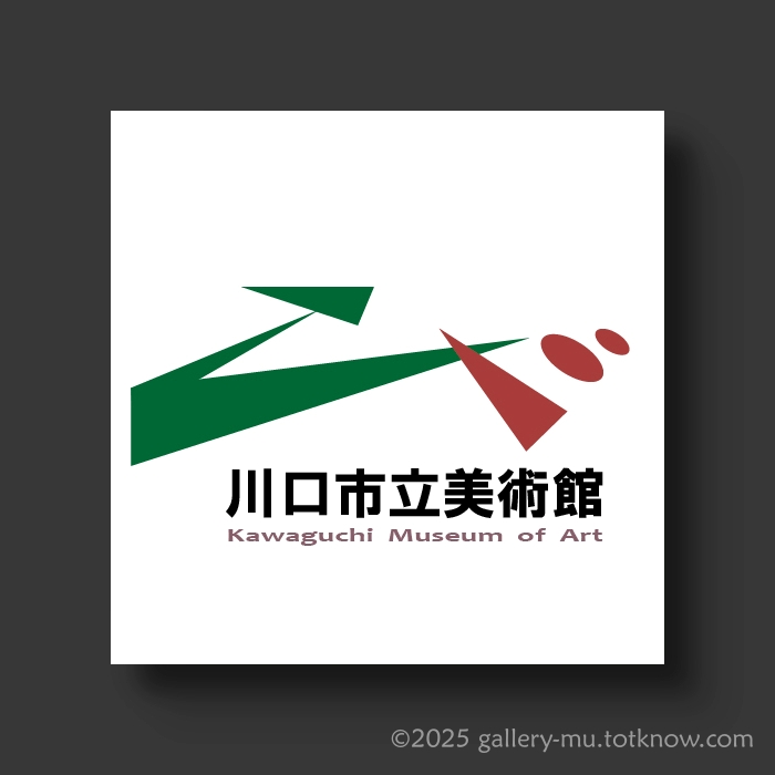
The design concept
The design of the “Bi(beauty)” is based on the motif of a [traditional] folded paper crane. The perspective of the rising right shoulder appeals to “inheritance” for the future. The color scheme is brown for the cupola and green for Angyo.
The “bi” design, based on the traditional folded paper crane motif, symbolizes local culture and hope for the future. The folded paper crane not only represents peace and harmony, but also embodies the philosophy of [symbiosis], where people support each other and walk together. The design incorporates an ascending perspective to powerfully express the “inheritance” of culture that will be passed on to the future. In addition, the large and small circles represent our hope that the new generation nurtured in this region will spread their wings. For the color scheme, we used brown to symbolize the cupola, a traditional Kawaguchi industry, and the lush greenery of Yasugyo’s plantings to express regional pride and respect for nature. We visualized our wish for the development and cultural growth of the entire region.
Looking Back
Submitting my work to the competition was, for me, an act of dialogue and discovery. Being selected was not the ultimate goal—instead, it was the process of thinking through ideas and shaping them into form that I believe will carry forward into future work.
There may be an opportunity to view the works of other participants at some point, and I look forward to seeing the diverse perspectives and expressions they brought to the theme.
Conclusion
This experience has further inspired me to actively pursue design projects that engage with themes of community and public value.
If you are interested in commissioning logo designs like the ones introduced here, please feel free to contact me through the form below.